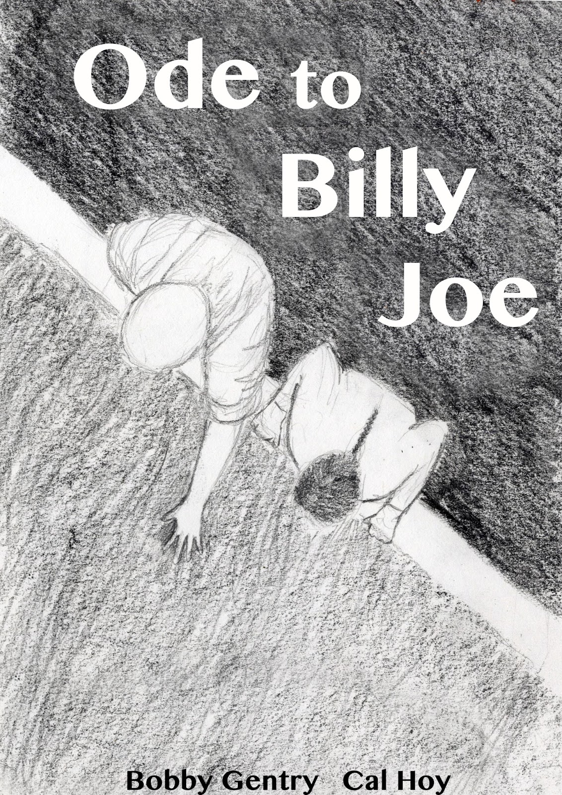
The brief is to create a graphic novel 2-3 pages long. That doesn't give a lot of space to develop a story, though at the rate I draw it's more than enough to do in the time available. I considered lots of options and decided that the story from a song would be short enough to cover. I've always enjoyed story songs and there are many to choose from. Ode to Billy Joe was sung by Bobby Gentry way back in 1967.
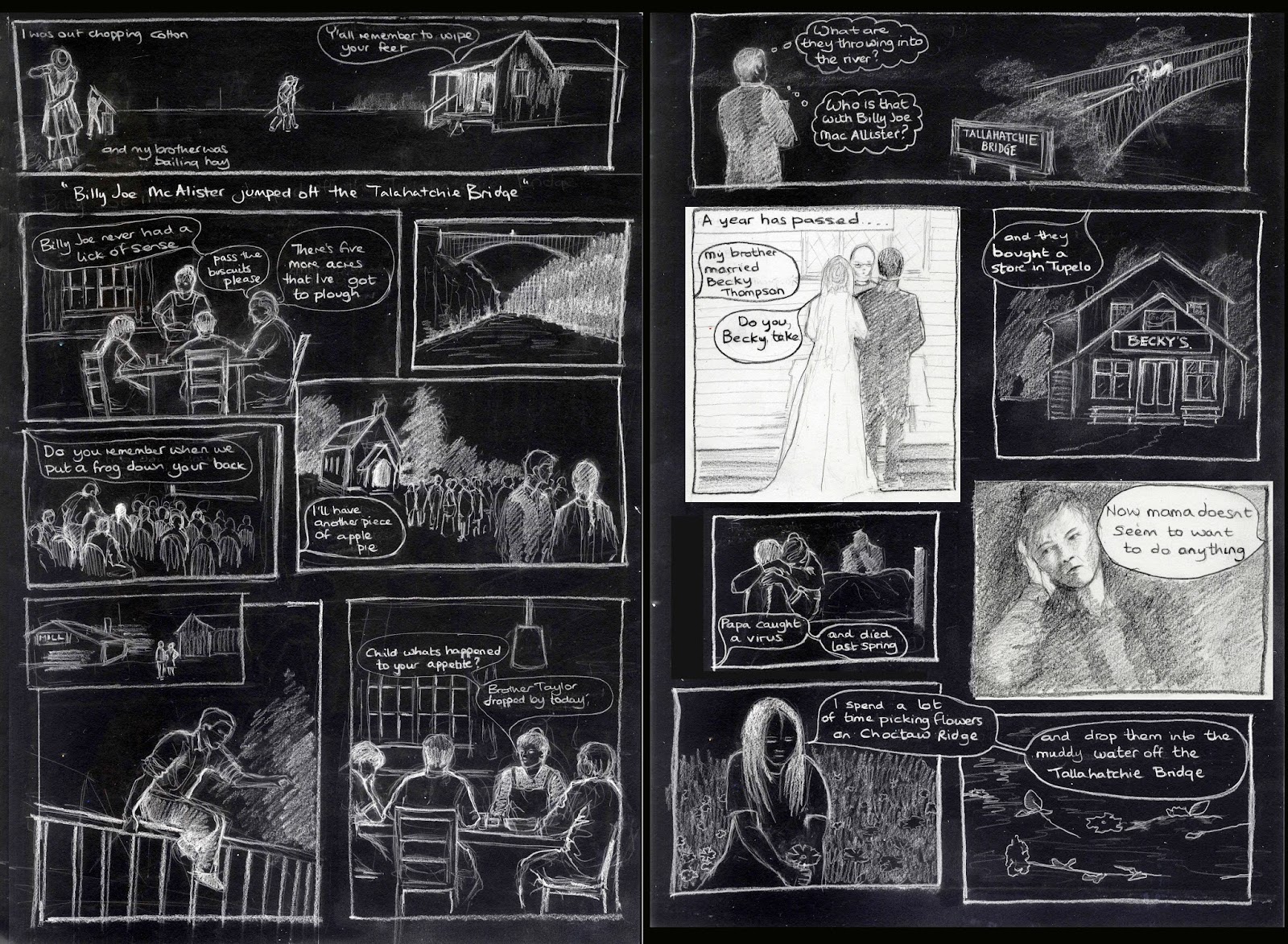
It was the third of June, another sleepy, dusty Delta day
I was out choppin' cotton, and my brother was balin' hay
And at dinner time we stopped and walked back to the house to eat
And mama hollered out the back door, y'all, remember to wipe your feet
And then she said, I got some news this mornin' from Choctaw Ridge
Today, Billy Joe MacAllister jumped off the Tallahatchie Bridge
And papa said to mama, as he passed around the blackeyed peas
Well, Billy Joe never had a lick of sense; pass the biscuits, please
There's five more acres in the lower forty I've got to plow
And mama said it was shame about Billy Joe, anyhow
Seems like nothin' ever comes to no good up on Choctaw Ridge
And now Billy Joe MacAllister's jumped off the Tallahatchie Bridge
And brother said he recollected when he, and Tom, and Billie Joe
Put a frog down my back at the Carroll County picture show
And wasn't I talkin' to him after church last Sunday night?
I'll have another piece-a apple pie; you know, it don't seem right
I saw him at the sawmill yesterday on Choctaw Ridge
And now ya tell me Billie Joe's jumped off the Tallahatchie Bridge
Apparently it caused a lot of interest at the time of release as everyone wanted to know what was thrown off the bridge and why Billy Joe jumped so I thought it was a sufficiently interesting story to turn into a novel.


Some sketchbook drawings to plan how the characters will be portrayed. I used photos from the internet as reference material.

Version 1

For the first frame I've made you read the lettering in the wrong order.


The story leaves a lot for the listener to decide so I wanted to reflect that with my illustrations but I wonder if I've been to obscure at times. Should I have explained that they were at the pictures? and I desperately want to change the next speech bubble to "I'll have another piece of apple pie please"


I noticed some errors, the mother's dress goes from light to dark in the two scenes in the kitchen.
The design is very safe and predictable, now I have my design I could try a different approach. I started by tracing the figures to see if I could change the artwork side whilst keeping the drawing fresh.


The brief also asks for a cover design.


Are the figures a bit small?


There are aspects of both of these that I quite like but neither enough to sort out the lettering.
Excited by this I inverted the story itself.

It doesn't work just as it is but there are elements, maybe if I mix them up?


Could I sex up the original drawing with filters?


I tried applying cyanotype to my covers.


Here I'm preferring the modified cover on the left.


so I darkened the background.

It's still not very clear. I think that the best way to deal with this is to give the black text a white outline but I can't persuade my elderly software to do this.
I find narrative illustration very challenging. Its juggling the elements of design with storytelling. Trying to explain in a way that isn't ambiguous hasn't left me much space to be inventive. I think that I did better on the earlier exercises than I have on the assignment because anything novel has to be carried through two pages. On the plus side I succeeded in my aim to tell the story within the pages rather than linking individual images but I think that making independent images worked best for me.
I find it difficult to maintain a character over multiple frames, the lazy way to do that is to give important characters highly distinctive recognisable features but my characters are fairly dull. How do you loosen up whilst holding all the other elements of a story together? It gives me an increased respect for Quentin Blake.
Drawing to tell a story really makes you focus on details, making sure that the figures are actually looking at each other, keeping things like hair colour and clothing consistent.
I've slipped back to drawing in pencil and I remember how much I like the feel of it. I need to find a way to make my pencil drawings work as digital images to be viewed clearly online and as permanent images in my sketchbook. I was tired of smudged graphite but I am resistant to aerosol fixers. Charcoal doesn't have the same feel and I need to investigate better surfaces which will hold and release the pigment better. My experiments with collage worked quite well and I need to remember to continue to use this technique in my work to add interest. Also making clay models to explore an idea is helpful and good to generate ideas.
Tutor feedback
She agreed that this exercise is more coherent than my previous cartoon strip and that the hand drawn text works so much better.
The cover lets it down because it really isn't in keeping with the story. I wonder if it might have helped if I had planned the cover alongside the story rather than doing it afterwards although I don't know if I could manage to juggle all the elements at once. Maybe my mistake was to try and keep experimenting when I designed the cover.

I doodled some more ideas in my sketchbook, working on some appropriate lettering. Everyone wants to know what was thrown off the bridge so it seems like a good topic for the cover. As part of my experiments I made a sweep of water on a sheet of paper and wrote into it with water-soluble ink using a brush.


but I think that I was too enthusiastic with the water. I tried some lettering with Photoshop.

I moved parts of the lettering to mimic the effects of water, then tried manipulating my hand drawn lettering using Photoshop

I like the lettering for Bobby Gentry and me which is drawn with straight lines to reflect the structure of the bridge but the title isn't right so I redrew the bridge.

Its too hesitant so I darkened it.

Then added the sky and a hint of colour for the river.

It's better than my first design in that it is closer to the illustration within but I'm not happy with the watery lettering. Is this a bit of a cliche?
No comments:
Post a Comment