After some research to remind me of potential proverbs I settled on birds of a feather flock together, which I interpret as;
- People will seek out others who have similar tastes and attributes.
- Some will be isolated by their differences although they seek to fit in with the crowd.


From this I expanded on the birds on a telegraph line.

Then drew them in coloured pencil on a blue acrylic ground.

The white bird doesn't show up well so I highlighted it in Photoshop.

The brief calls for 2 illustrations so maybe the way to display them is like this.
or this

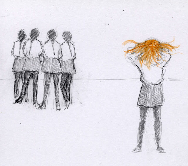
Birds is a very literal interpretation so I sketched out some other ideas using people.

I'm not sure that I like the dancers enough to put in the work develop them.

I prefer this version. I don't want to take it any further because I think that it would lose some of the immediacy of the drawing although the hair of the red-head could have been drawn better. I wanted it to be wild and untamable so that she would never be able to fit in with the others.
Somehow I drifted back to birds. My feedback from my last assignment suggested trying different materials so I made far too many potato prints.


When I did them I wasn't excited by them but now I'm scanning them in I think that they may have some potential.

I added a cerise bird as the outsider.

Is this a bit too obvious? Blue coloured pencil is too subtle.

I had to put a ring around it to show which bird it was.

even black ink isn't obvious.
Finally I did some designs based on the Twitter logo which I can't post here for copyright reasons.
What worked?
I like this drawing but I don't know if it's too sketchy and unpolished. Would display it in a similar way to the bird illustrations.
The bird drawings are a bit obvious but more polished.
Have I really fulfilled the brief for this exercise in that my illustrations derive from each other rather than being two standalone images.
The brief says:
"Think about how you use the two images in relationship to one another. How do you create a comparison between the symbolism of the good with the bad? Think specifically about which elements in the illustration you need to tweak to make this work successfully."
So it doesn't seem to worry about this too much, indeed I have made the comparison by tweaking the design. It does worry me that I've used birds as my symbols which is very obvious, and humans which is what the proverb is all about, but it seems bit forced and strained to change to a random species just because I want to be different.
I looked up flock in the dictionary and it seems to be confined to birds, goats and sheep so I guess the other obvious choice is sheep.
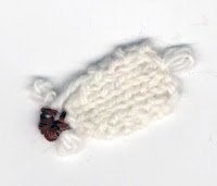
My feedback suggested using different materials including collage. I rejected the obvious choice of cotton wool and knitted a tiny sheep shape.
The "face" is embroidered on. It's supposed to be a view from above although I agree that it doesn't look much like a sheep. I copied him with Photoshop to create a flock.
On the screen they look a bit pale so I darkened the background.
 For the alternative version I needed a black sheep. I tried colouring my white sheep in Photoshop but it didn't look right so I knitted another one in navy wool because that was all I had in the house. Again he isn't very sheep like but maybe that's a good thing as it's less obvious.
It's different to the earlier versions but I'm still working on different illustrations of the same idea, a closed group and a different looking individual as the outsider. Is there a different way of looking at this? I need to step away from it for a bit and have a think.
Tutor feedback
She liked the experiments but didn't initially get the illustrations using the girls and the sheep. She did say that once she understood them she felt that they had potential. I agree that they are an oblique take on the proverb and I'm not surprised that they didn't immediately resonate with her. Is the potential in the medium? (the knitted sheep?) or the idea? I guess it depends on the use of the illustration. Where is it going to be published? what sort of text will accompany it? Who is the expected audience? In my feedback she suggested that I looked at Mark Herald's illustrations. Could the sheep feature on a mug or a cushion? Maybe with real knitted sheep?
The girls are more traditionally illustrative and would be more in place in a story or a book. I feel that they are aimed at an audience of teenage girls, but would they understand the reference? or do I really want them to see the concept rather than the proverb.
She liked the bird version which I had rejected for being too obvious. I think that the course has made me so much bolder with colour and aware of the effects of tone and composition.


No comments:
Post a Comment