but I still froze, and then someone came along and parked a van in front of me blocking the view.
I made some studies of areas that I know well using Google street view for reference.

The views are a bit dull and I can't get excited by them.
I took some photos while walking my dog, working on the contrast between the field and the surrounding housing estate.

Then did an ink drawing.

which I coloured (left to right) on the computer which is too flat, then with watercolour. For the version on the far right I upped the tone with photoshop, it has punch but it looks a bit summery... The contrast is between the field and the houses but maybe that's too subtle. The house (actually I think that it might be flats) was built as part of the first stage of the new town in the early 1950's although it was conceived in the 1940's
Back to the Kodak building.

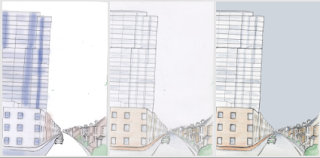
Sketchbook planning, I considered making the top of the flats bigger so that they loom over the houses but I'm not convinced.

Then with colour.
On the left I tested my colour ideas on the computer then used coloured pencil on the middle one and then changed the sky to a looming grey in keeping with the threatening flats but is also rather flat and not in keeping with the rest of the picture.
The Kodak building was part of the original New Town development a landmark that became redundant when computers no longer took up a whole room and auto dictation replaced the typing pool. It was developed into flats in 2010 and has a composite facade in blue and white which replaced the earlier concrete exterior. The conversion was designed to attract young buyers from out of town. The cottages across the road are typical Victorian terraces. They are of the typical 2 up 2 down style probably built to house workers for the paper industry or maybe staff for the railway.

I think that this was my best image. My work could have been strenghtened by more detailed on site drawing but it snowed at the weekend and it's still frozen out there. I guess that true illustrators sometimes need to work from photographic sources so its probably a good exercise, however I'm left with the haunting doubt that I've not selected the best example of architectural contrast but as I can't think of a better idea at the moment I'm moving on to the next project.


No comments:
Post a Comment