For this assignment I wanted to challenge myself to do something out of my comfort zone so I looked for competitions that are live and I could conceivably enter. The only live competition that I could find was YCN. I chose to produce some illustrations for Childline
Looking through the brief these are the points that I need to consider;
"increasingly many young people talk to us through one-to-one online chat rather than on the phone."
Looking through the brief these are the points that I need to consider;
"increasingly many young people talk to us through one-to-one online chat rather than on the phone."
"we love our illustrations to be bold, warm, fun and engaging."
The top 10 searches on our site last year were:
- Self-harm
- Bullying
- Puberty
- Exams
- Anxiety
- Depression
- Games
- Suicide
- Sexting
- Sex
- Creative requirements
Hope and positivity. Imaginative ways of showing the journey to better mental health, a life free of pain;
Difficult feelings and experiences. Ways of representing dark thoughts, painful/ abusive experiences and trauma.


Difficult feelings and experiences. Ways of representing dark thoughts, painful/ abusive experiences and trauma.
To help you here are some ways we support young people experiencing dark thoughts:
- Imagination. Imagine things are going well and you’re coping. In your mind, picture a favourite place. It could be somewhere real or made-up. Imagine you’re there. Create a mental image of yourself coping really well and getting help with what’s going on;
- Relax. Focus on 1 thing you’re doing right now. Concentrate on your body, not on your thoughts. You could have a warm bath or just lie down on your bed or the sofa. Try tensing your muscles and then slowly relaxing them, or taking deep breaths through your nose and out through your mouth;
- Positivity. Think of a positive phrase which reminds you that you can cope with things. It should be in the first person (‘I’ and ‘me’). And in the present tense (‘I am’ or ‘I do’ not ‘I will’ or ‘I am going to’);
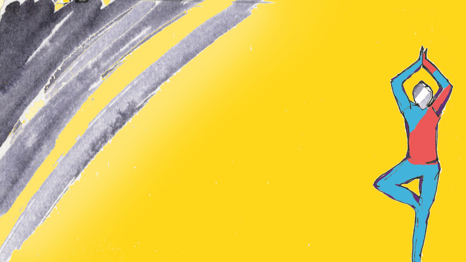
- Exercise. Everyone enjoys something different. It could be running, walking, football, skipping, dancing or yoga. You could try a few different things and see what you like.

The Times of India has an article about relaxing colours.

Looking at Childline's resources I am daunted by the high quality examples of professional work that I find. Look at this film, and this one.
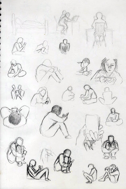
My first idea needs a figure messaging Childline so I need a drawing with the right feel. Cue more sketches both from imagination, referenced online images and past sketchbook drawings.


The zigzag in the head jumps about a lot and isn't very visually exciting so I looked at getting the way that talking to someone about a problem can make you feel better.
Maybe it would bring colour back into your life.


The brief talks about Childline brand colours but doesn't define them so I took some screenshots from the website and collaged them together for reference.
 I feel that abstract images can convey the feelings of the caller in distress and calm them. I'm thinking Finbar Mc Hugh but I'm not as talented. I played with splashed and dribbled colour.
 I'm not sure how to reconcile this colour work with the brief which says "Use the Childline brand colours as much as you can (but don’t be constrained by them if you think another colour will help with what you’re creating)." so I did some abstract doodling on the computer using the brand colours.
 Its designed to represent that feeling when your head is spinning with abstract spiky ideas. This can be morphed with some of the tools and lenses in Photoshop.


I had another go at animating this transformation. I want it to end in a happy place.
 Like here. These are all Childline colours.


 What I'm working on here, between drawing Fleur with a buster collar on sleeping with Eric the cat, is the fact that sport and exercise can help, and that there is a way out from the black cloud that is depression.


 I don't like the clothes colour combination so here's an alternative.


The other imagery that I have in my mind is of a flower blooming and the above version leads itself to a floral image.

 But now I'm not happy with my cloud.


 And if I change the cloud then the head, which was sampled from the cloud, doesn't work.


 And I've moved so far away from the black cloud image that they don't fit together anymore.

Summary, what have I created?


Re watching the videos after a few weeks I am happier with the colour changing hands on the phone than I was when I made it. Overall I don't think that the videos are good enough but they could act as a sort of a proposal, like a storyboard which directs someone who has more advanced animation skills to bring life to my idea.
What do I think is the best idea?

My first idea needs a figure messaging Childline so I need a drawing with the right feel. Cue more sketches both from imagination, referenced online images and past sketchbook drawings.


Of all the drawings this is the figure I like best.

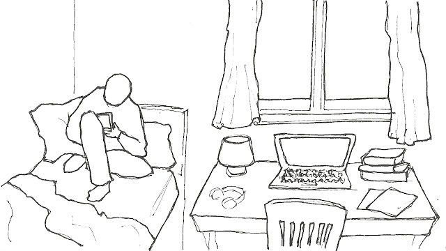
I'm looking for a simple but realistic person. I don't want them to be too identifiable in terms of sex race etc but I'm not good at sympathetic cartoon characters. The figure needs to be in a safe space to call Childline so I'm going to put them in their bedroom. This room needs to look realistic, lived in and not too polished. It has to resonate with children from all walks of life so I think it's best to keep it simple. Looking for examples I found this great photography project by Rania Matar which manages to show something universal about the personal space that is a teenagers bedroom.

I wanted to show how phoning Childline could clear a troubled mind so I had a go at a simple animation.
(If it won't work you can see this video here)
The zigzag in the head jumps about a lot and isn't very visually exciting so I looked at getting the way that talking to someone about a problem can make you feel better.
Maybe it would bring colour back into your life.
(Link to this video here)
The video flickers which needs some technical fixing but I'm not sure that the underlying idea is strong enough to justify the time taken. I have concerns that the figure will be identified as white/black male/female depending on how I colour them and the brief asks for inclusivity. This may be better achieved by showing less of the person.
More sketchbook ideas. I took the hands and made a short animation of them changing colour.
(Link here)
I'm aware that my animation isn't up to scratch so I need to consider a static image.
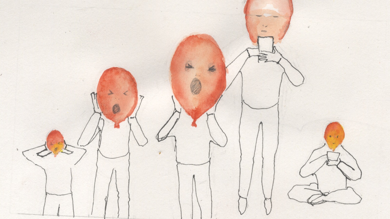
Does the caller feel trapped before they contact Childline?
The website has a game where the user can inflate a balloon and let their troubles float away. Here is a variant on that theme.
 |
| Sketchbook preparation |
 |
| Watercolour |
 |
| Coloured pencil |
Maybe with faces.


Maybe felt tip or collage?

Here is a more finished version using paper collaged balloons.


I had another go at animating this transformation. I want it to end in a happy place.

(Link here)
I'm still not managing to make the transitions smooth. It does look better as an abstract but it's not good enough.
Back to still images. I had originally thought that I could release the trapped phone user

and let them dance away, so I drew some feet. (on the same page as the balloon collage)

Initially I experimented with oil pastel but I don't have all the Childline colours and I wasn't happy with the effects so I switched to coloured pencils.

I don't feel that the idea of walking away from the trapped hands is working but there are other ideas here. The colours form a rainbow. The sad person might move from dull socks to bright rainbow socks.

Do the socks need legs? And would they be better not in a line?

I think that I prefer the first version.
Still not happy that I've nailed this so back to the sketchbook.


Lets take the sport and exercise version first. I often doodle little figures standing in crowds, I wondered what I could do with them if they did some exercise so I put them together, in a similar way to Luke Adam Hawker's drawings.

With added colour:


I'm not sure that the colour quite does what I want it to. I'm restricting it to Childline colours and I don't want to colour in each figure because I want the race to be ambiguous. I deliberately didn't fill the colour in smoothly in some of the pictures because I think that aiming for perfection is one of the main problems that I have with digital art. However I think that the best version is this one.

or this one which happened accidentally when I was getting rid of the multicoloured version with the flood fill tool.
Maybe I'm just trying to be too ambiguous with race, maybe I just need to look for balance.

I did this version after I'd done some of the later work though I've put it in here so it's easy to follow the illustration ideas. I think that it benefited from me stepping away from this part of the project and playing with other ideas which fed into this version. The digital colouring isn't subtle but that's appropriate for the brief. I want bold simple and a bit childish because I think that this will be reassuring to the website users.
.......................
The other idea was this for feeling sad, sitting under a black cloud.

And this for driving the cloud away with exercise.

With a bit more layering of the cloud and added colour;

For this idea I feel very restricted by the Childline brand colours. Maybe I'm trying to be too complicated with the clothes?


Still images


Videos
What do I think is the best idea?
This is the best of my videos.
but I don't think that any of the videos are professional to fulfil the brief. The still illustrations are better and of them I prefer these:
This is very typical of what I do although it's bolder and simpler than I usually do for a finished piece.
This is a bit different to my normal style and I think that it works quite well. What do you think? would you choose a different illustration?
Conclusion
I'm comfortable drawing portraits of pets and people in pastel or coloured pencil, designing Christmas cards which are usually mixed media or a combination of watercolour coloured pencil and digital mixed media and making medical illustrations in ink but I've never tackled this sort of brief unless it was coursework. Doing this made me very aware of how OCA briefs are targeted to be a learning experience. I thought that I would find it easy to focus on an external competition but because I didn't have a contract with anyone else to produce the images I didn't feel enough pressure and I missed the feedback from a real customer. Usually I show my ideas to my client and check that they fulfil their expectations, this felt very different. It has advantages in that it allowed me to develop my illustrations and follow my own ideas so I had the opportunity to do something different.
I feel that I never managed to get fully into the flow of this project and I think that this is because it's not really suitable for my style or abilities, I think that a gif style animation is what is needed and maybe instead of trying to make my own gif I should have storyboarded my ideas which would have given me the opportunity to focus on an original idea rather that the technical challenges of animation although I learnt loads from my experiments with Photoshop.
What I've learnt is that I like trying to explain and educate with my illustrations and I don't find it as easy to convey feelings or atmosphere. I prefer more finite direction from my customer or the relative comfort of self directed work like the Christmas cards.
At the end of the course I have strategies to come up with an idea in response to a brief and I am more confident that I can make an illustration for a variety of purposes even if it's not what I'm used to doing. I'm happier with experimentation but I need to involve a third party to help me judge the value of my more experimental work because left to my own devices I will reject the more unusual response in favour of something safe and normal. I have enjoyed using collage and making 3 dimensional paper sculptures and I want to take some time to explore the possibilities of zines and artists books. I feel that my future as an illustrator involves medical illustration and self directed work but I am looking forward to the next part of the course where I might change my mind.
Tutor feedback
My tutor felt that the brief is about talking through text and that although my early animations responded to this I lost my way with the later versions.
I bought a mount for my phone which enables me to hold it still above a drawing and used the Stop Motion Studio app that I download for the animation exercise earlier in the course. Then I printed out the drawing of the person in the bedroom.

Using coloured pencils in the Childline brand colours I coloured in the drawing incrementally, setting the Stop Motion app to take a photo every 10 seconds which stopped me from fiddling or colouring in too much at a time.
The lighting is inconsistent so I repeated with 2 light sources and turned the autofocus off on my phone.
This was much better but when I tried to repeat it with better, more subtle, incremental colouring I got the flickering effect again. I don't know if this was because I moved one of the lights slightly, they are both very elderly angle poise lamps. Alternatively could it have been caused by me listening to music on Spotify whilst I made the animation? Some sort of interference?
No comments:
Post a Comment