"Produce a series of black and white illustrations in response to a popular fairy story or folk
tale of your choice. Your illustrations will sit alongside the text to enhance the reading
experience."
The Frog Prince because it's a simple but well known story. Then I drew frogs from Google images to get in the right frame of mind.

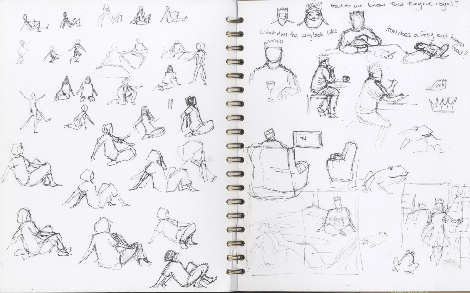
Some sketchbook ideas.
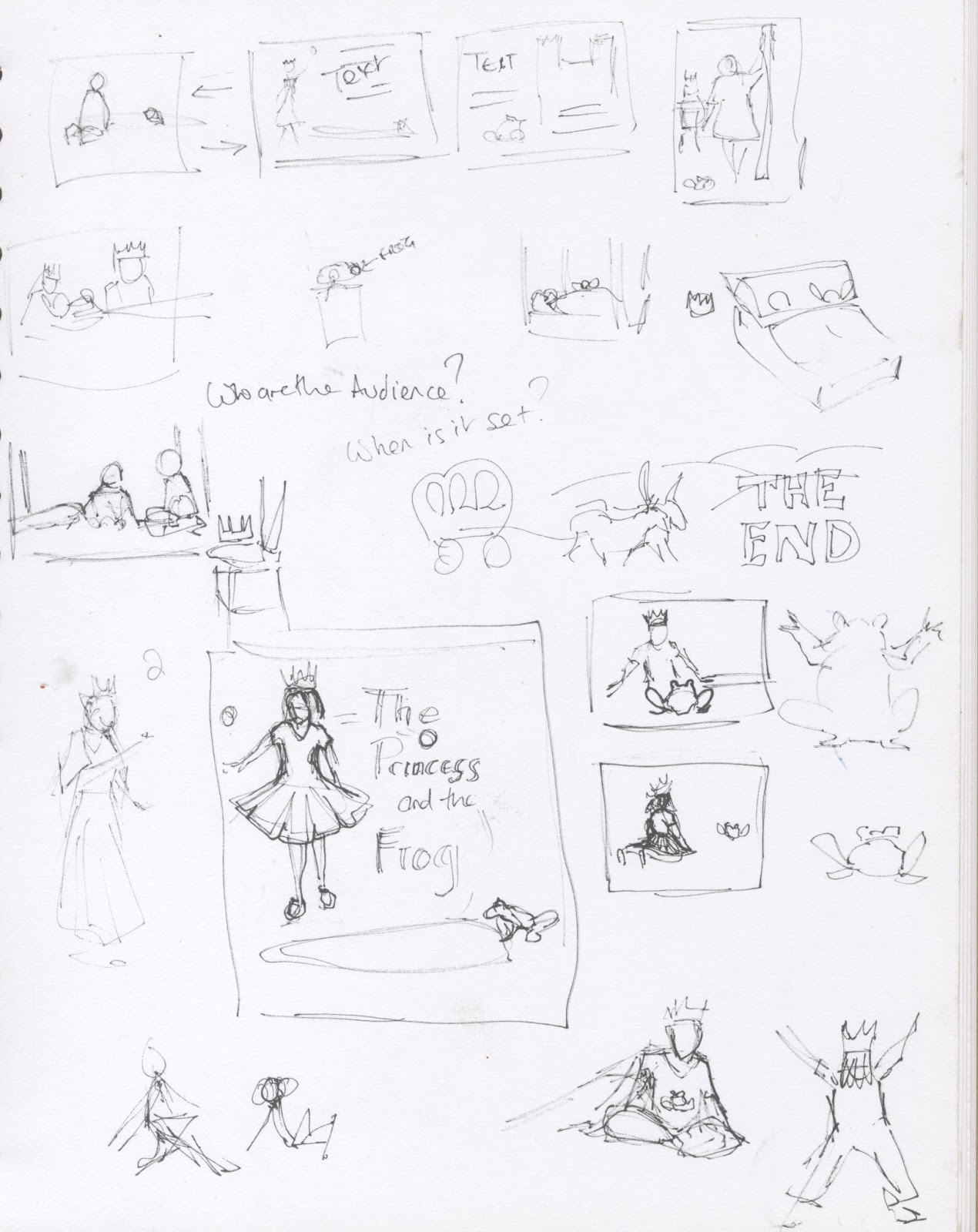

In response to my tutors suggestion of more collage experiments I thought about a cutout frog.
 |
| or an origami one. |

I haven't got any black paper suitable for origami so I tried making a frog on white paper and inverting the image.

It's not very successful so if I want to do this I need to source some better paper.
It's very easy to set the story in the romantic 19th Century fantasy world that Arthur Rackham defined for them but being a contrarian I'm going for a modern interpretation which I think would make the story more accessible to a modern child although how they will interpret black and white illustrations in the age of the iPad is debatable.
My first attempt was in charcoal. I had a vague idea of a drawing of the princess and frog asleep overdrawn with one of them awake, like a still from a William Kentridge animation.

I'm guilty of not pursuing this idea but I just couldn't get excited about it. Instead I roughed the illustrations out in pencil and added the detail in ink.


(Initially I was going to give the princess black hair but its very ageing!)

These simple line drawings are difficult to see so I added darker lines and fixed some of the issues I didn't like by glueing paper over them in the manner of illustrations from the 50's and 60's.


There's still not enough contrast in the pictures. This was a design fault because I concentrated on telling the story and the angles of the pictures rather than the atmosphere of the scene itself. Arthur Rackham's illustrations have a lot of contrast between dark and light. The problem with adding too much dark in a black and white illustration is that if the text is supposed to go over it it will be difficult to read. I do think the I can add a few more dark areas to some of the illustrations to strengthen the design.


How would they work with text?


I haven't included all of the text, I'm assuming that the story isn't a picture book but has blocks of text alongside the illustrations.
Should I have used my cut out frogs rather than drawing them in? It's a bit late to change my mind but Photoshop is all powerful....


or with the cut-out rotated

The cutout frog changes the style of the illustration. The story is a fantasy and by making the frog unreal against the real characters it emphasises this, however I think that it would sit better in the story if the illustrations had been built around it rather than grafting it on at the end. I had darkened the areas around the white frogs but the black cutouts need white around them to show them off.
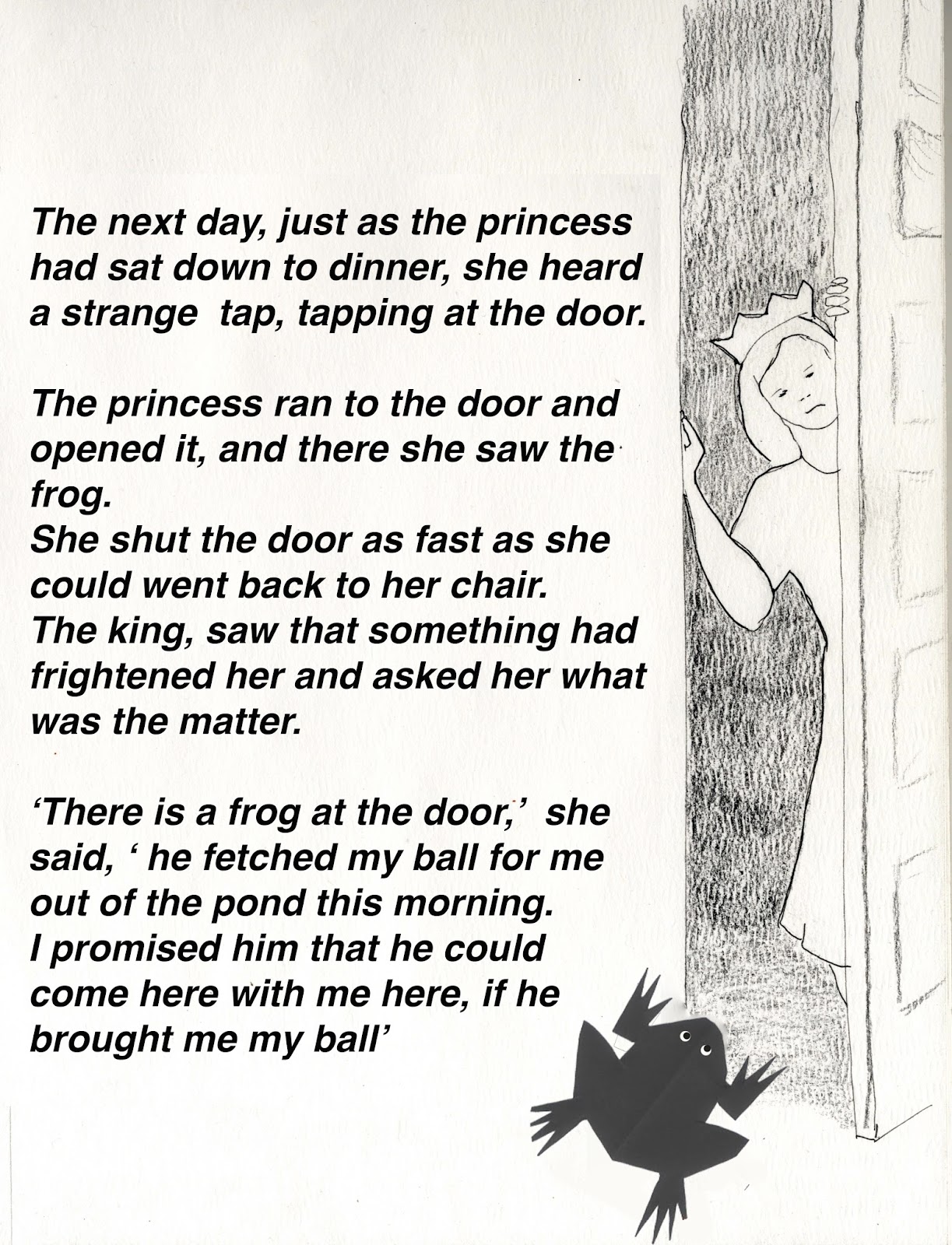
With the darker frog I don't need to darken the doorway as much.
Reflection
I'm not massively pleased with these illustrations. They lack contrast which would have given them more drama. Maybe I should have strengthened the lines of the original line drawings to make a colouring book version? I should have thought about lighting in my initial roughs, I've been concentrating on adding colour in a believable way as colour was a weakness if mine, so when colour is taken away it highlights the lack of contrast (which is essential for good colour illustrations too). The pictures do support the story and I hope that they add a dimension to it, I would be very shocked to wake up to a man in my bed even if he was a prince, in the story the princess seems to take this in her stride.
Maybe I've tried to do too many illustrations for the time available? I saw the fairy tale as a picture book but five illustrations have taken me more than a month to complete, and I haven't drawn the carriage pulling away to take the happy couple to the princes' kingdom. However if I go back and start again I will never complete this module within the deadline, so, reluctantly, I'm posting this exercise and moving on for now.
Part 2
So having said that I'd finished I couldn't walk away. The collage gave a hint of a different approach so I cut out the princess and the frog and made them a collaged background.

I lightened the background so that it could take the text then scanned a paintbrush to make more realistic grass.

That didn't work but a bunch of dried lavender makes a shrub for the foreground.

Here is the illustration with text.

I applied the same process to the illustration of the frog eating off the princesses plate which I think is the weakest illustration.

It's still not the best picture but its better than before.

Here it is with added text.
The bedroom scene is also weak. I experimented with a scarf for the bedclothes.

but it lacks contrast and the scan makes the scarf look grubby so I went back to paper.

Is it too dark with a black background? I needed shadow beneath the princess to make her stand out but when I'd finished I wished that I had added the morning light streaming into the room from a window which would have needed to be behind her as there is no space behind the prince. I probably shouldn't have used the leaf cut paper again but I haven't got that many pieces of scrap paper that would be suitable. It does link the pictures together.

Here it is with text and with the princess angled back a bit more as I didn't think her body language was very surprised in the last scan.
I am reasonably happy with this spread

So although I'm sure that it could benefit from collage treatment I really think that I need to step away from this exercise and get on with the rest of the course. Overall I do think that the collage has improved the illustrations although better consideration of contrast at the start would have made some better pictures. Often my work improves when I go beyond when I think that I have finished and I need to balance this with the need to get work done.
Tutor feedback
She agreed that this exercise was a bit of a struggle and that the collaged elements did add some interest to a fairly dull set of drawings. I see this exercise as a developmental stage and I would approach it differently if I did it again, starting with the collage and maybe some background colour or texture. The finished images are too static and overworked because I have tightened up the drawings as I tried to push them forward rather than loosening up. Having a baseline set of images which I could submit often works well for me because I then relax and feel that I have permission to experiment. I need to skip this stage and go straight to experiments but I think that I was daunted by the number of pictures that I needed to make for this exercise. As this part of the course went on I became more used to doing multiple drawings of the same characters so I am more relaxed about this now.
No comments:
Post a Comment